Canon Product Support Website

My Role
Strategy, research, UX Design
Other contributors: Randy McDonald, Austin Ragsdale, Amanda Boshard
Background
Canon is a global consumer electronics retailer. Part of Canon's role and the manufacturer of its products is to provide product support to customers who need it. About half of all traffic to Canon's site currently is for support-related needs.
Despite the large amount of traffic, Canon's support website feels small and antiquated. It doesn't meet the brand standards that users expect.
UX Challenge
How do we maximize the value of the support home and product detail pages so that users can find the support they expect from Canon efficiently?

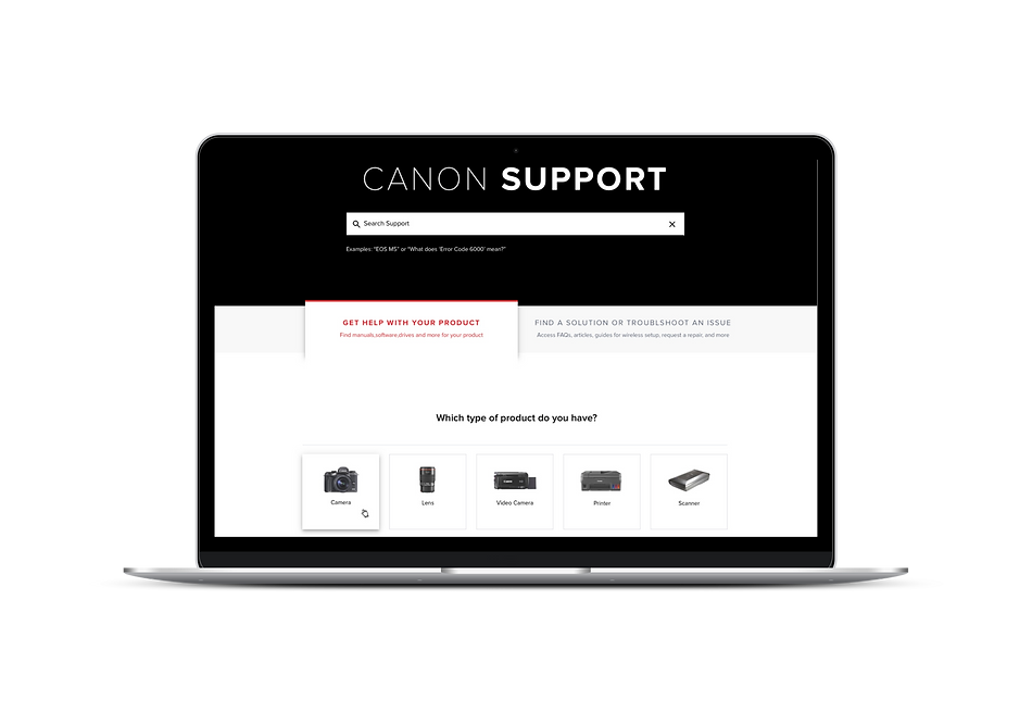
The old experience
Scope
Our initial scope was to redesign of two specific areas of the consumer support experience: the Support Home page and the Support Product detail page.
Constraints
Due to budget constraints, our scope was narrowed to designing just two page templates that would be the foundation for much of the experience.
1. Audit of the current experience
I did an “audit” of Canon’s support experience using UX best practices and guidelines as my metrics to evaluate the current experience.


The product of my audit of the product support home and support detail page. The green labels are strengths and the red are opportunities for improvement.
2. Documenting how users seek product support
The support team had already done their own user research and allowed us to use that as we created the user journeys depicting the ideal experience of interacting with the product support pages of the website.

This is a journey of a user who needs to find the right software to download to her computer so she can get her photos from her camera to her desktop computer.
3. An "Aha" moment from stakeholder interviews
As I was working through the journeys and trying to understand the broader ecosystem of how a user gets support, I was enlightened by a comment that one of the members of the Customer Support team said during one of our strategy meetings:
“Users think about product support in one of two ways – either by the product or by the problem. But, either way, we need to know their product at the end of the day to help them.”
After reflecting on this, I realized that the goal would be to get users to the Support Product Detail Page - that was what was going to provide them the most contextual information.
Also, we would provide users two different paths: A "by product" path and a "by solution" path, both of which would take the users to the Support Product Detail Page.
4. Developing Page Description Diagrams
Before getting into design, we knew that it would be important to determine the strategy of the support page(s) that we intended to design. We needed a tool that would help us define the strategy and assert a clear point of view and ultimately give us actionable ways to design the page. Most importantly, we needed a tool to communicate the strategy of the page(s) to the client before getting into wireframes.
Page description diagrams were a perfect way to do this. They help us outline clearly how users get to the page, how they leave (where we want them to go), the core content (high level), the goal of the page, and most importantly, the goal of the user when she gets to this page.

Support Landing (Home) Page: Page Description Diagram 1

Support Landing (Home) Page: Page Description Diagram 2. This indicates the priority of content on the page and shows the two paths ("by product" and "by solution") at work.
5. Wireframing the Support Home Page
The two tab approach was at the heart of the Support Home page but the rest of the content was still important to ensuring a holistic experience. I prioritized search at the top, the two-tabbed PDP finder was second on the page and additional support content followed.

Initial exploration of the product support home page
We used a 2-tab approach to finding the PDP: One for a "by product" and the other for "by solution."


6. Prototyping the Support home page
To test the interaction myself and create a way for users to test it to, I developed a prototype of the Product Support Home page using Axure.
Product support home page prototype
7. Wireframing the Support Detail Page
The Support Product Detail Page would serve as a one-stop shop for all product support needs

Initial exploration of the product support home page

Support Product Detail Page Wireframe (Downloads & Drivers section.) Note the black sticky header at the top that has anchor links to sections throughout the page. Also note that each section has additional tabs on the left side.
8. Prototyping the product detail page
To test the interaction myself and create a way for users to test it to, I developed a prototype of the Product Support Support Detail Page using Axure. Using the prototypes for the Support Home and Support Product Detail page, I could test the entire flow.
Product support detail page prototype
9. User Testing & Learnings
I designed the test prototype, script, and recruited the participants for the study. We recruited 8 participants to participate in 6 different support-specific tasks. Our team's researcher, conducted the study.
Paths tested:
-
Find your product's support detail page
-
Find downloads or drivers
-
Find what came in the box
A few learnings:
Finding products is simple.
Overall, testers found it easy to find their products. The images really helped guide them through the process of sifting through many products to find what they needed.
The default tab is the main path
The majority of testers did not seem to notice the second "Find a solution" tab. We decided to keep it but improve the visual treatment. This is something that we would need to test further.
The top navigation is... perhaps overkill
On the product support detail page, people recognized that it was long scroll page and tended to use that as their primary means for moving about the page rather than using the anchor links on the top navigation. Due to time constraints, we did not test this further but a more simplified navigation could be just as effective.
After the testing, we modified the wireframes where needed.
10. Final UI
Support Home Page: Final UI

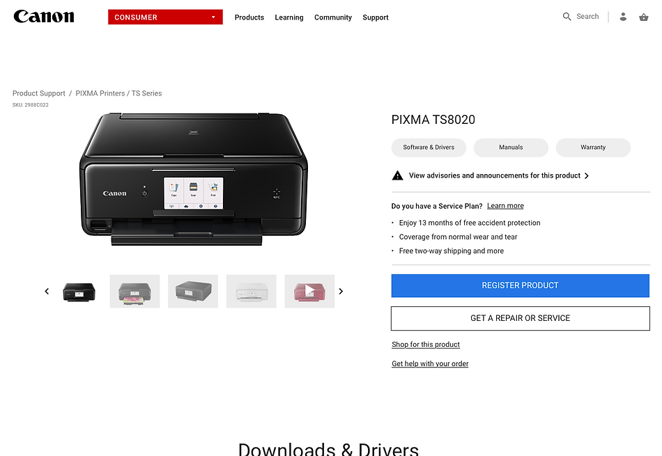
Support Product Detail Page: Final UI. Note that the black navigation bar is present on page load, making it easer for users to see and use.

Product Detail Page Final UI. Note that this is showing the NEW tab approach which has horizontal tabs instead of vertical.
Next Steps & Outcomes
I accepted a new position at Vivint Smart Home before we were able to carry out the rest of this work but our plan was to conduct additional user tests on the newest Support home and product detail page high-fidelity designers.
I would do Card Sorting exercises to determine better nomenclature for the Support product detail page categories
Our team will work on additional pages within the support experience that are not covered in this project.
Lessons Learned
1. Plan for more rounds of user testing up front. While we got some great insights from our first round, I think we would get even more the second time.
2. Content decisions take time. Organizing the support product detail page was much more time consuming that I had anticipated and required a lot of back and forth with the client. We have a good structure going forward and I look forward to the opportunity to conduct some card sorting to help us really nail down the content organization on the page.